
FILLER FILLER FILLER FILLER FILLER FILLER FILLER FILLER FILLER FILLER FILLER FILLER FILLER FILLER
Arianna Morese
Beverage Campaign
2022
To bring together the many skills I have acquired over the past few years, this project involved coming up with a beverage brand from scratch and creating package designs and advertisements accordingly. Tools ranged from creating vector graphics in Adobe Illustrator to advertisements utilizing product photography and Adobe Photoshop.


Left: Print Ad (Variation 1)
Right: Print Ad (Variation 2)


Tools and Process
Unlike past advertisement projects, this one challenged me to come up with a completely original product and company. I chose to create a retro 50s-themed soda designed to be sold at movie theaters. With this came along the logos and packaging, sketches of which were drawn on paper (as seen to the left).
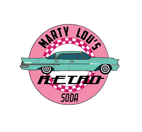
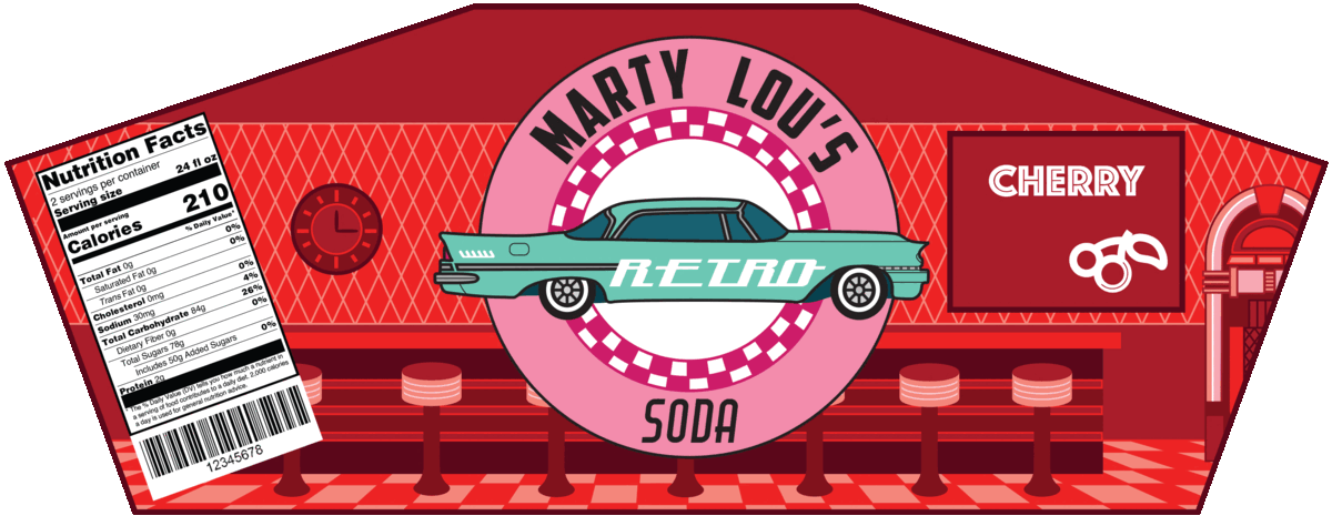
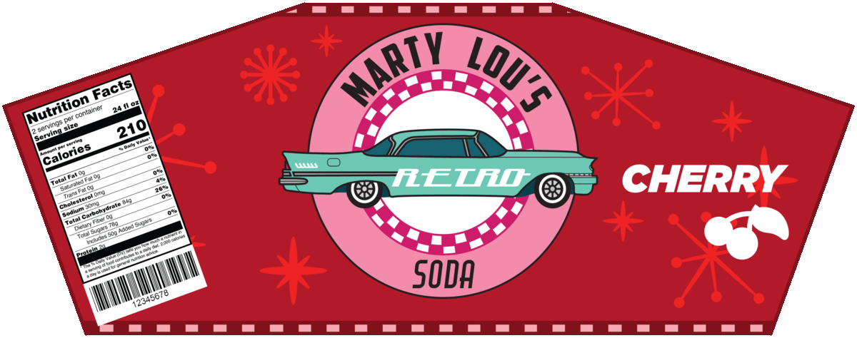
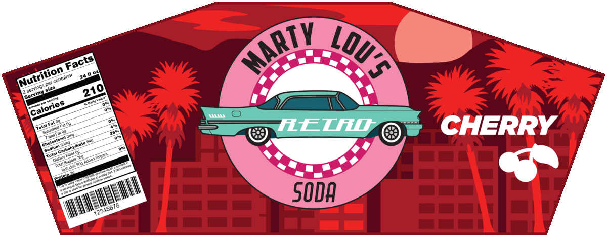
The first half of this project consisted of logo and package design, which were finalized in Adobe Illustrator. To align with the movie theme, the first logo variant was chosen as it provided a more clear yet subtle reference to the 1985 film Back to the Future. To add an element of interactivity, a peel-off sticker shaped like a movie ticket was included on the label. These stickers were designed to include a random movie trivia fact as well as to entice customers to collect them as turning in three would allow for a customer to get a free drink.
The second half of the project involved photographing the final products and utilizing these photos to create print and social media advertisements. Adjustments to these photos were completed as necessary in Adobe Lightroom Classic and Adobe Photoshop, with the print ads being completed in Photoshop as well. The social media ads were designed in a format akin to an Instagram Story and were therefore meant to be brief and viewed on mobile phones. These ads were created in Adobe Premiere Pro. Any photos that I did not take myself, such as the drive-in theater photos, were provided through the Public Domain.
Left: Logo variants
Right: Package variants
Learning Experience
Due to the project incorporating skills I was already familiar with, this project provided a healthy challenge without feeling too overwhelming. Some challenges I ran into mainly involved the initial process of creating the package design as it took a bit of trial and error to come up with a label that would form around the package shape I chose. Once I figured out a shape that worked, I decided to create every variation of the package I sketched in Adobe Illustrator, starting off in grayscale to help me contrast the shapes from one another. Even though I went through the extra effort of making all three label variations in all three colors, it ended up providing me with the freedom to pick from a wide selection of designs.
In addition to label design, I gained new experience with photographing drinks in particular. As mine included a whipped cream topping, I learned that real whipped cream has a tendency to melt fast under the strong lighting and had to be replaced often. For future beverage product photography, I may utilize more artificial aspects in addition to the ones I used such as the dyed seltzer for representing soda and the plastic cubes for ice cubes.
All logo variations
Performance Evaluation
I felt that, unlike many past projects I have worked on, I was able to manage my time very efficiently and keep myself on track. I was also very confident in my abilities in both the conceptualization process as well as ideation, to which I felt had attributed to motivating me to push forward and not get too overwhelmed by small inconveniences. Any setback I faced in the creation of this project just made it all the more interesting for me and allowed me to learn new things I did not initially expect.
In the future, I may choose to create a product prototype that is more practical. Specifically, for this one I used an entire 68 oz bottle of seltzer water when taking photos of the drinks. As I had to use food dye to make them look convincingly like sodas, all of the seltzer remained undrinkable by the end of the photoshoot. This was further emphasized by all of the whipped cream melted into the liquid by the end as well.
Label designs (all variations)
The beverage campaign project ended up being one that was very engaging and enjoyable for me. As it tested my abilities in a wide variety of programs and formats, it proved as a confidence booster to myself as it allowed for the opportunity to focus more on being creative than having to learn a set of new and unfamiliar skills. I am very proud of the end results as well as the process I took to get there.


